I would have extended the ending to be:
"Whoops! My bad!"
"C-can I still come?"
""Sure, as long as you have an invitation!"
"..."
21 Art Reviews
10 w/ ResponsesThis shouldn't be "M", she's in a swimsuit. Either "E" or "T".
I take issue with the story here.
This guy opens up by saying hi and talking to her about an earlier event where she stopped a "runaway mail truck". So we immediately know he's not being perverse, he's wants to mention a good deed she did. This also sets up the idea that this girl is a good person if this event from earlier is anything to go by. Right after he decides to compliment her breasts, she takes offense and punches him in the nuts.
There are 3 things wrong with this:
1. His words did not justify a rude retaliation.
Yes it's an awkward thing for a guy to say, but the way he says "Nice Breasts" is shown to not be objectifying.; It's like if someone said nice stomach. In truth, she should have used an awkward response, like saying "(Awkward face)Wow I didn't notice..." or "Why are you talking about my breasts?".
If you wanted him to seem rude, he should have objectified her. Make him say "Nice jugs" or "Ya got some juicy melons", so he actually compares her chest to something to objectify it. This would call for a retaliation, however not a physical one.
2. The action does not fit her character.
There may be more pages to this story, but based off the material presented here, her violent outburst does not match her "heroic-persona".
3. Her action isn't even clever.
When you break down what happens, a guy comes up says some words, and a girl just punches him. Let's assume he does say an insensitive phrase that isn't "Nice breasts".
-Something like "Sweet Milk-bags!"
Character-wise, anyone can defeat someone by punching them, but it's a cheap way to defeat someone who's being mean. What would have looked better is if she used a comeback line to humiliate him. Something like "Thanks, you too", "I can't say the same for your nuts", or even a genuine rejection "Thanks, you're not getting any though".
Even if you wanted her to use violent action, punching is too severe. Typically the accepted response would be a slap. Heck her right arm in the 3rd panel is perfectly place to back-hand this guy's face.
Afterwards you can even have her respond with the comeback, something like "Can't say the same for your manners."
I love Batman's design in this, and seeing him with Deku is awesome. Especially since Batman wouldn't be considered a hero in MHA, as he doesn't have any powers.
My main issue is...why is Deku chubby? We know he's ripped, as we've seen him without his shirt on.
bocodamondo responds:
thats just the shirt,(supposed to be pushed up by the belt) not his actual body
A pretty cool image and bleak expression.
Nice character design and slick outfit with metal pieces on the sleeves.
Worst part has to be the bottom white fade. it's just so distracting, I would prefer if it wasn't there.
I think the phone should of only had her card on it.
----------
It just looks like a bunch of green and brunch squares from this view. It's too finely detailed to be viewed as a "Dark magician Girl deck. Not to mention because of the tiny details of the screen the viewer's attention can be drawn there rather than to the DM girl holding the phone.
Atleast if it was just the DMG card, we could see it better.
bocodamondo responds:
it does, the deck she's showing is a "dark magician girl" deck
It's a big shirt so that you can fit 2 people inside for a "big hug".
Scorci responds:
Genius!!
I figured this wasn't originally meant to be a "Peachette" character.
Still this is very cute and sexy.
STANNco responds:
It was actually. The idea behind it was, now we can pretend shy gal is canon.
I started on it before the whole competition thing.
Nice.
Great choice of colors, -soft and pleasing to the eye.
You gotta love collars and girls wearing collars.
-Those are some huge tatas though...
Akutox3 responds:
Thanks, glad you like it
Nice!
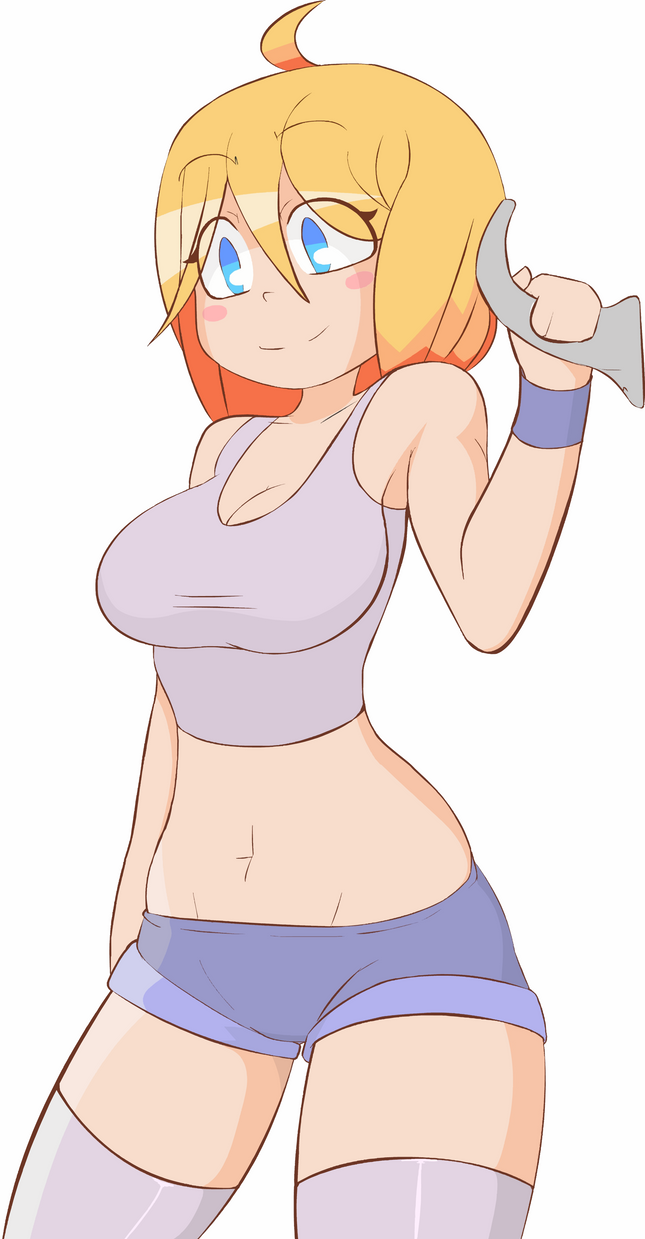
Excellent work on the torso, looks very natural.
I think that is also thanks to how this was exported, the character's proportions seem to have been resized, which is nice as it works a lot better than before.
This also seems to be a higher quality image than the previous one.
-There isn't much I can say without repeating myself, looks very good. I might like to work with you on an animation one day.
-I also noticed blush marks, I also think they're better, but a little hard to notice. Maybe they could be a deeper shade of pink.
(Like this version here that I've altered.)
http://pre11.deviantart.net/50ac/th/pre/i/2016/357/c/c/lux_cheek_rcolor_by_kryssenrobinson-daslh1d.png
I've been animating for over 5 years. I like to make animations that are usually funny or cute.
Age 28, Male
New Mexico
Joined on 10/11/14

- Level:
- 9
- Exp Points:
- 847 / 900
- Exp Rank:
- 83,327
- Vote Power:
- 5.15 votes
- Rank:
- Civilian
- Global Rank:
- > 100,000
- Blams:
- 0
- Saves:
- 3
- B/P Bonus:
- 0%
- Whistle:
- Normal
- Trophies:
- 11